Tradebay is a platform which helps buyers and sellers navigate the fruit industry global marketplace freely and independently. In 2021 I joined and helped them restructure and re-design their customer app. Tradebay is composed of a public-facing website for everyone to view and a private customer app for registered users. I worked closely with the founders to decide what should be on the public-facing website and what information the users should see when registered in their dashboard. The dashboard has a lot of different information and needs to be tailored for both buyers and sellers of the fruit industry. Due to this complexity, I made a lot of sketches and wireframing before jumping into the design. Below I describe this process.
Tradebay - The Global Fruit Trading Community
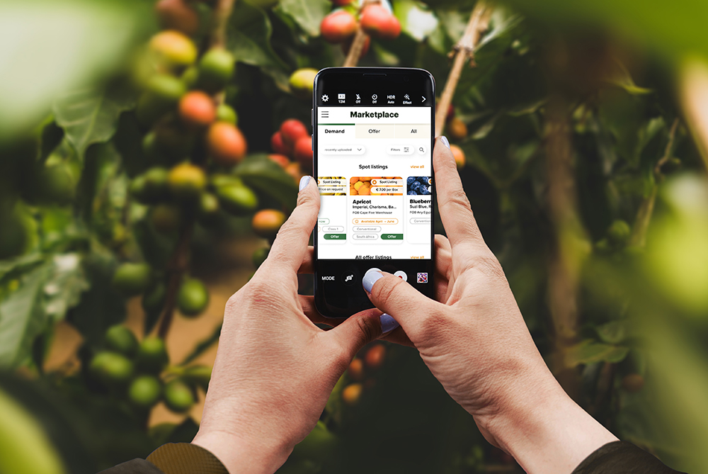
mobile mock-up for the marketplace re-design
How the Customer App is Structured
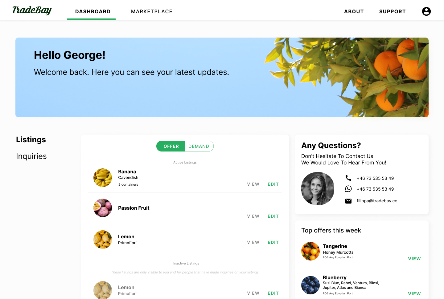
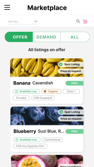
One is able to register for the Tradebay App either as a seller of fruit or a buyer of fruit. If you are a buyer you are able to look at what is in the marketplace (a catalog with the fruit being offered) and make an offer to of the producers with the amount you would like buy and how much you would like to pay. If there is a fruit variety which you would like to buy but do not see in the marketplace you can create a fruit listing with the fruit type you "demand". In the same way, sellers make fruit listings with the fruit they have to offer. Buyers and sellers interact with each other within the app to negotiate which fruits are sold and bought. The Dashboard for users of Tradebay consists of "the Marketplace", a place where you can see which fruits are being offered and which are on the demand, "My listings", a section where you can edit the listings you have made with the fruit you want to sell or the fruit you want to buy, "My organization", a section for you to describe how your company is called, what you do, etc., and "Inquiries", a sort of "chat-room" where you can talk to other users who want to buy or sell products. One of the first sections I worked on with Tradebay was the Markeplace.
A general refresh
One of the first things I worked on for Tradebay was a general refresh of the user app. I began to think how the navigation and structure of the existing app could be improved and what the working priority for this should be. I looked at inspiration and started to mark wireframes of ideas which I presented to the team. Below are some examples of the slides I presented as well as a screenshot of the how the user app looked when I joined Tradebay. You can download the full presentation here.
User app before the re-design
presentation for re-design
presentation for re-design
presentation for re-design
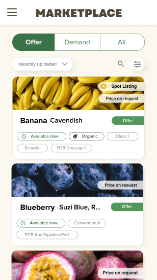
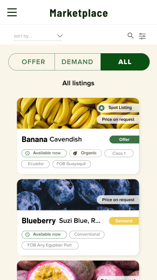
Marketplace re-design
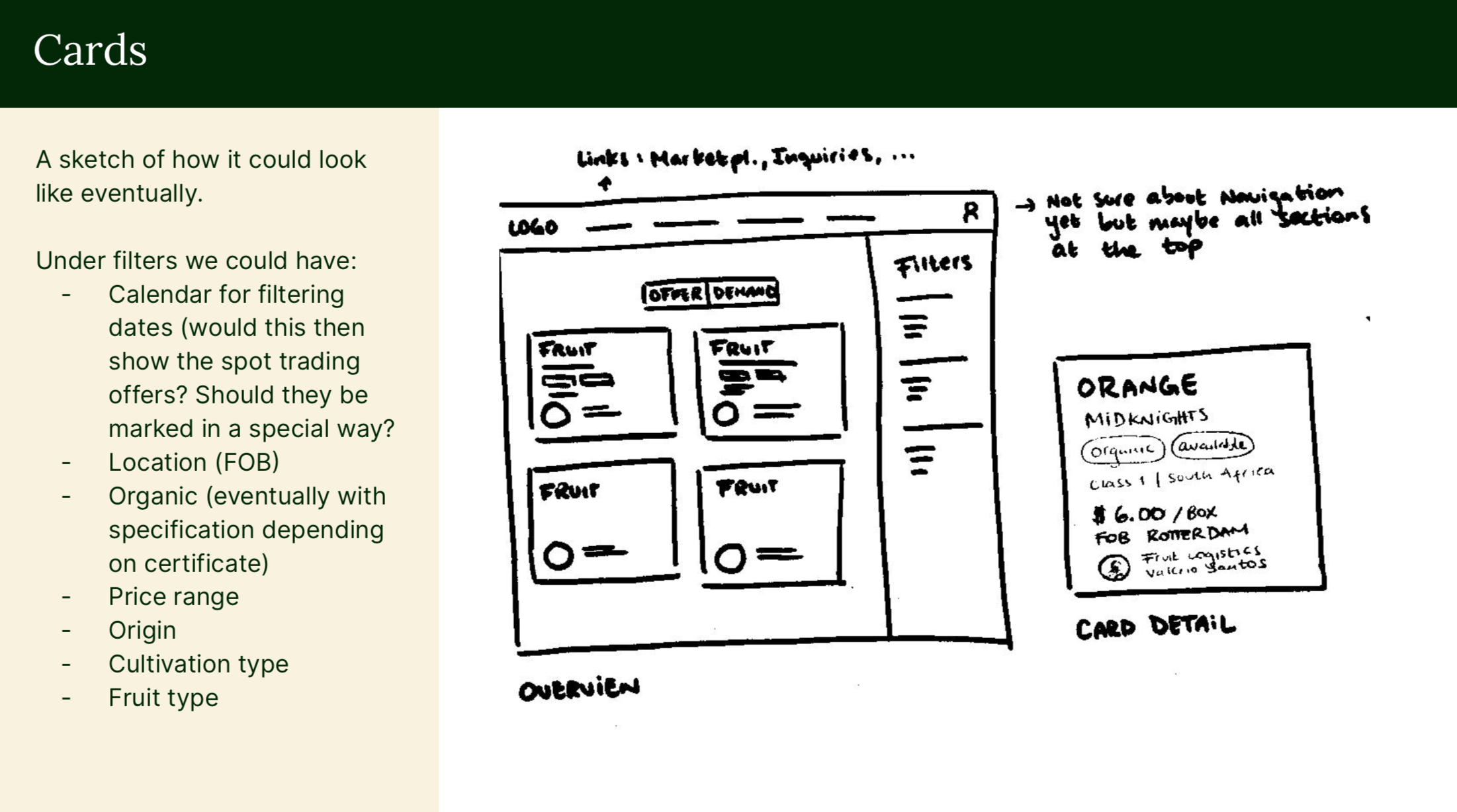
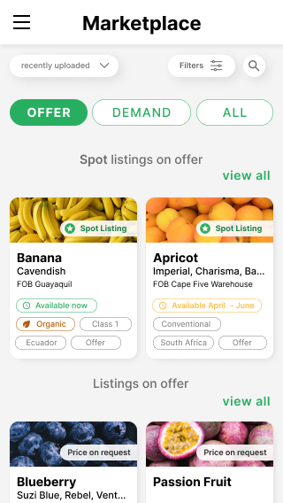
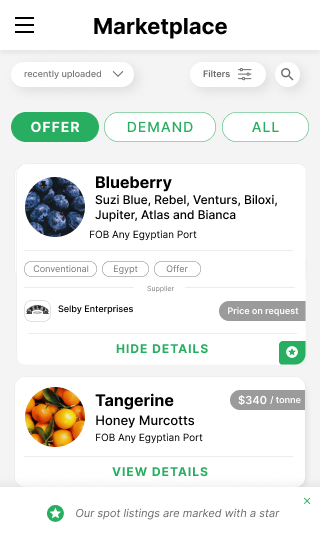
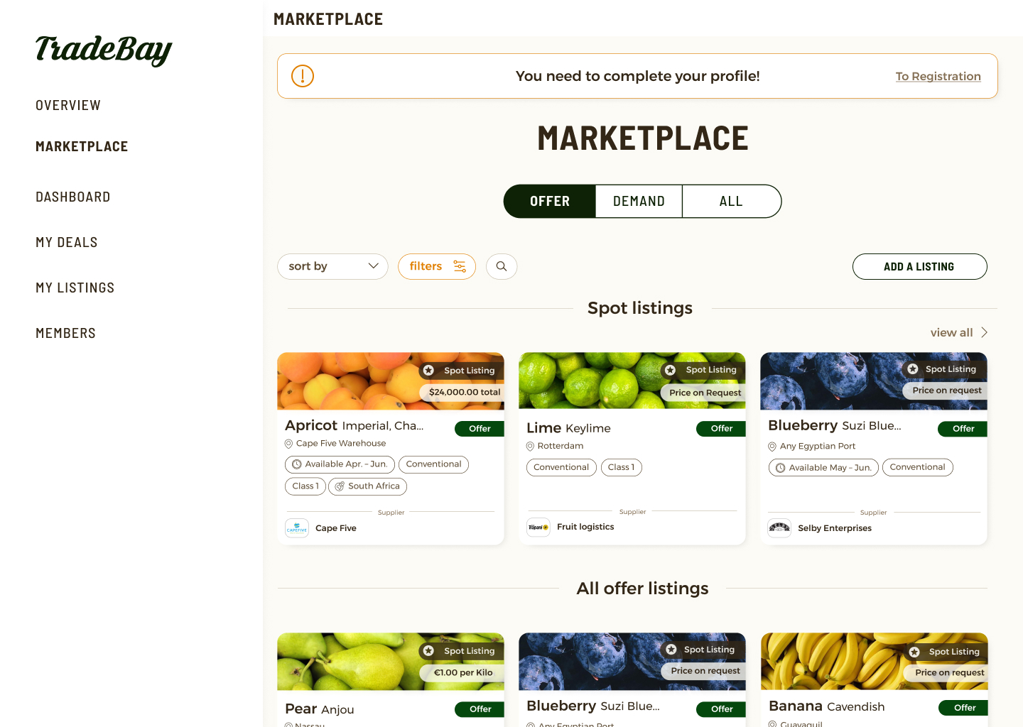
After discussing the ideas I presented to the team in the presentation above, we decided to focus on the re-design of marketplace. While working of the new colors and UI elements (more details can be seen here. ) I made high-fidelity mock-ups of the product cards and filters. I made the designs mobile-first keeping in mind that most users navigate their accounts on their cell-phones. One of the first things I worked was the design of the product cards. The original product cards were horizontal and took a lot of space. I decided to try out a more compact vertical design which could be organized as a grid. Below is a version the horizontal design in the dashboard which I adjusted with the new design elements. Followed this is a selection of many variations of the more compact cards I designed for the marketplace.
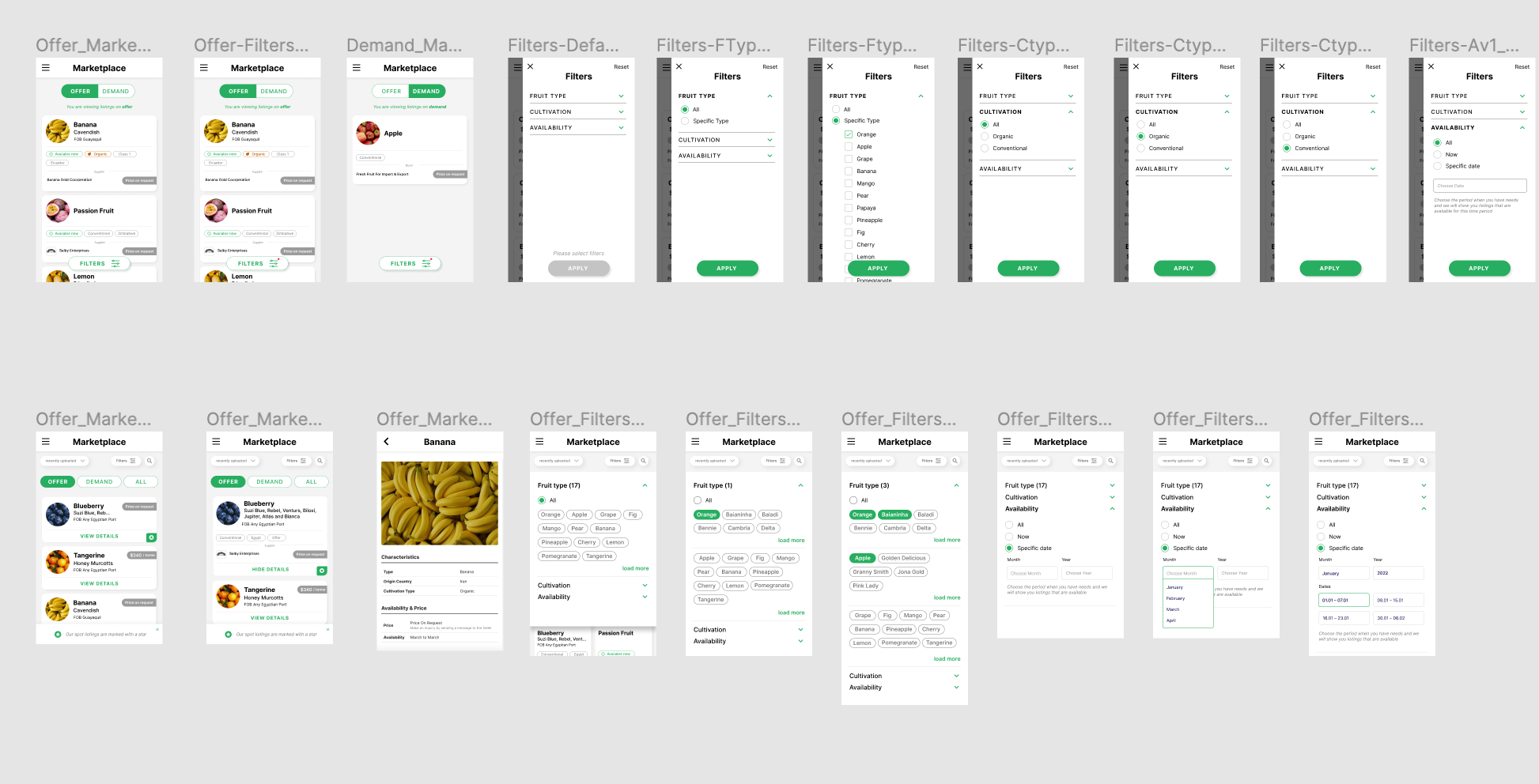
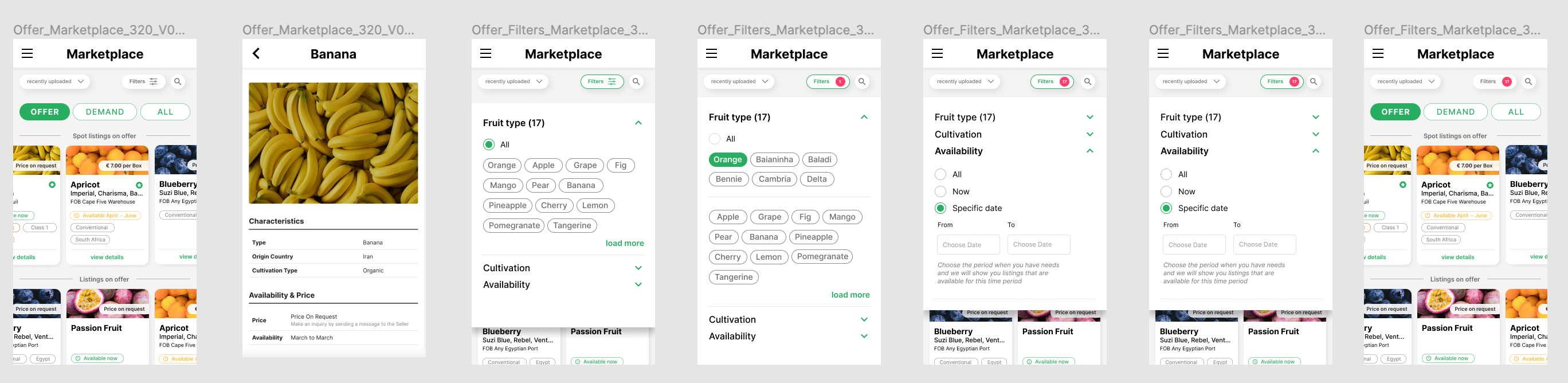
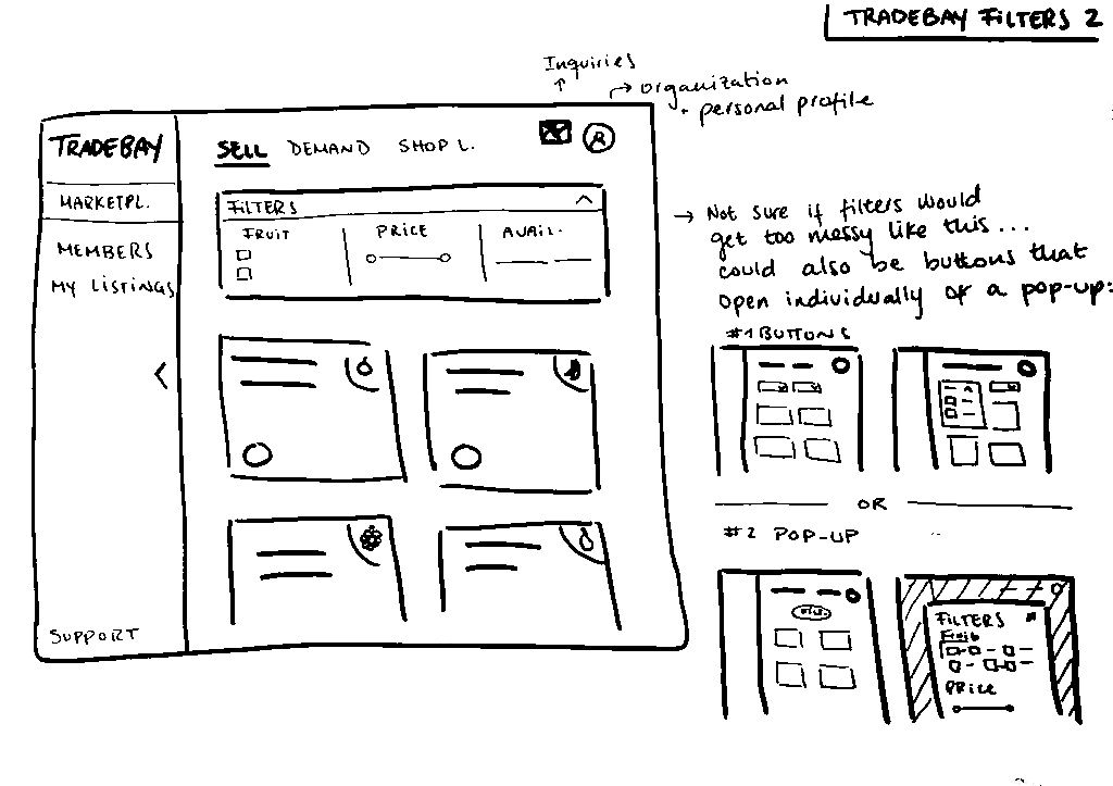
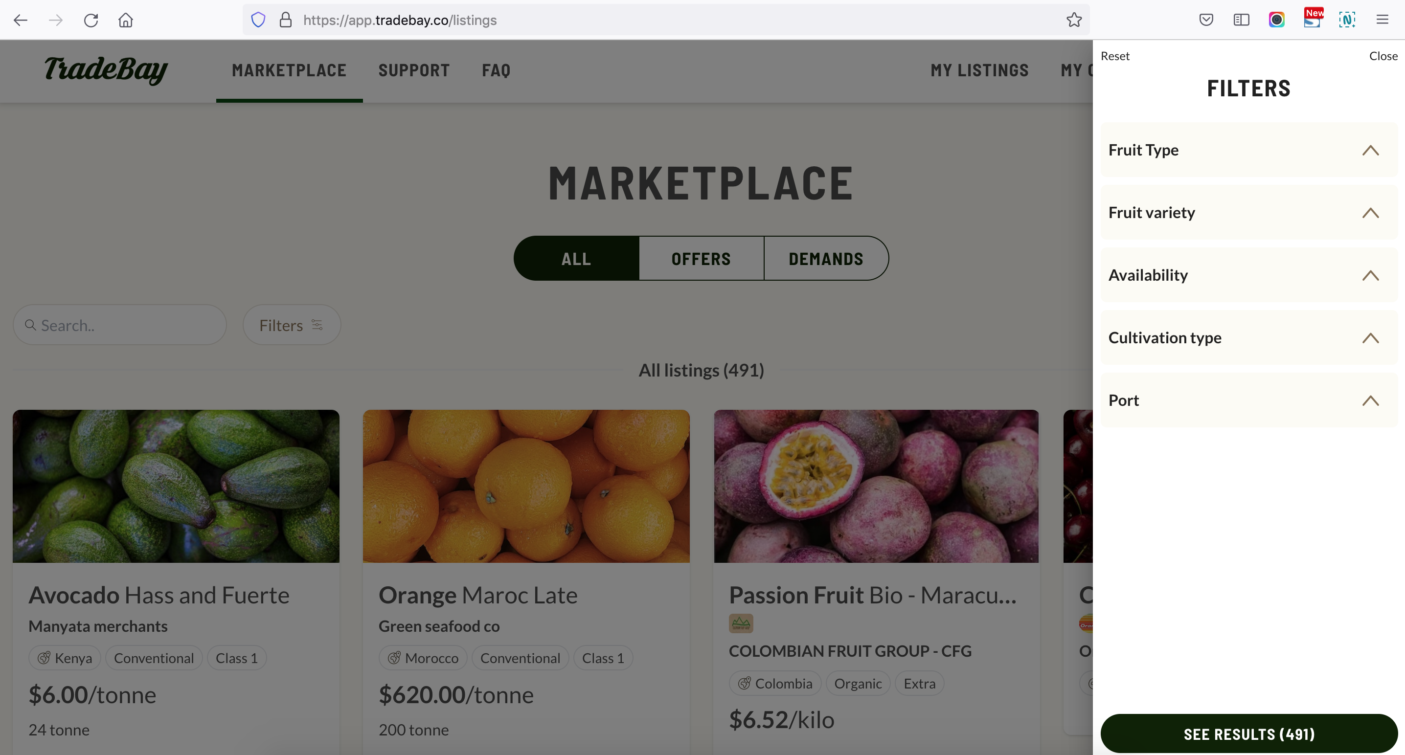
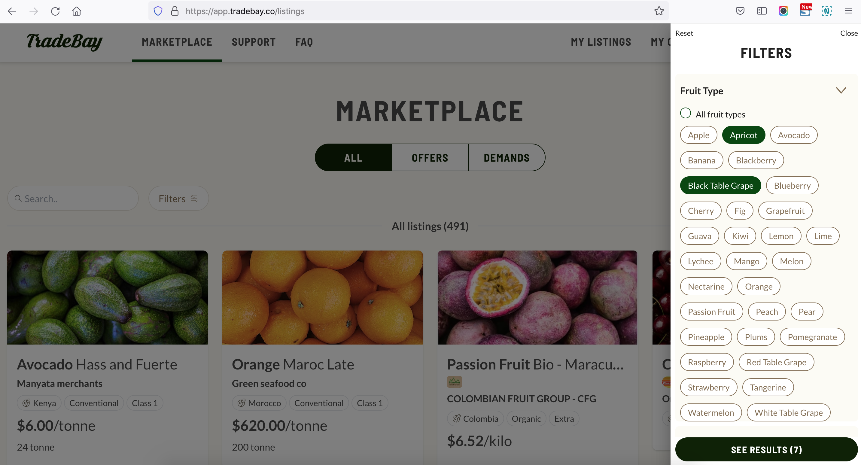
Implementing the filters
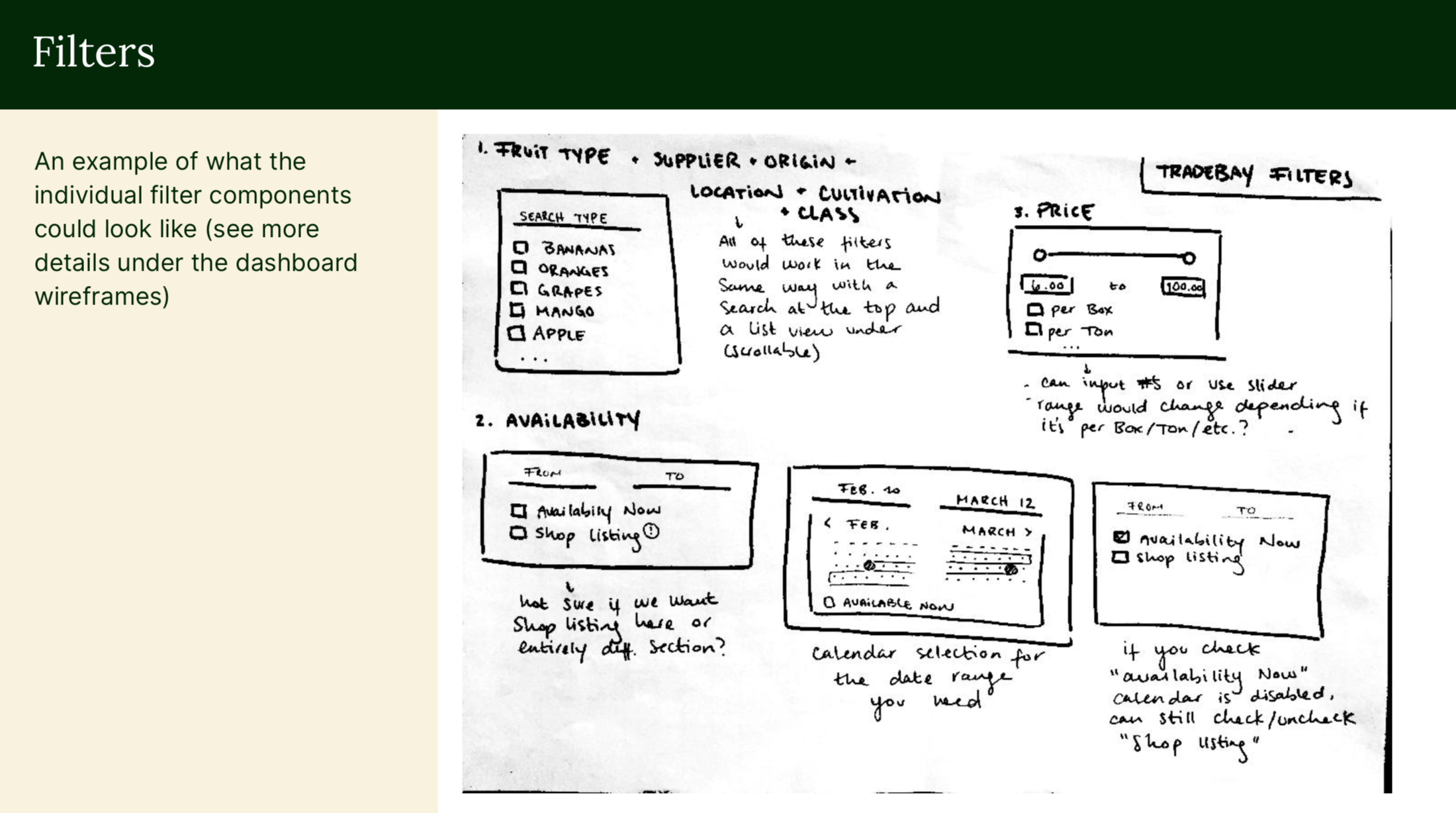
One of the most complicated things I worked on in the marketplace was the filter design. I was provided by the team with all the different fruit varieties and options a user could choose from to view the products. It was challenging to plan how all this could be presentation in a clear manner in the smallest possible mobile viewport. Below are two examples of the filters flow made in Figma.
Brainstorming for the navigation
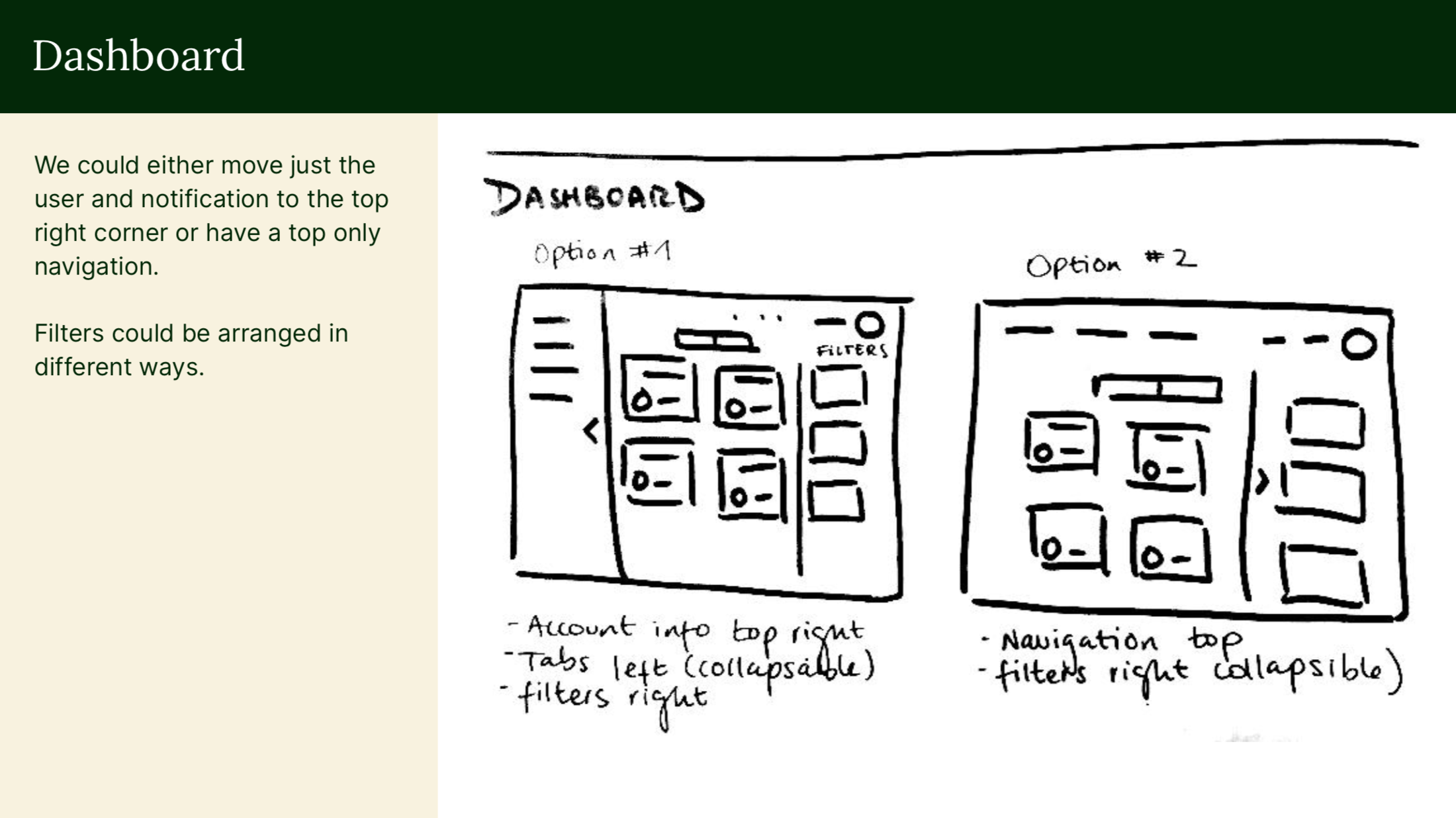
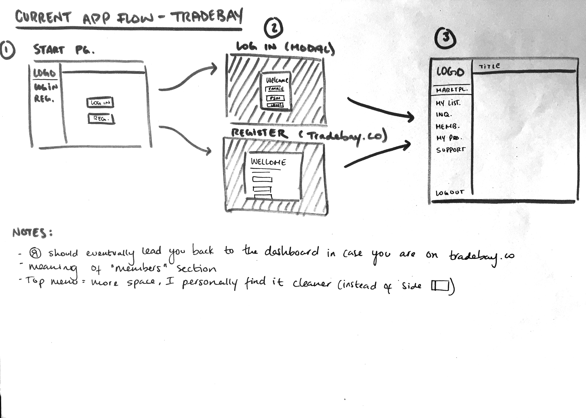
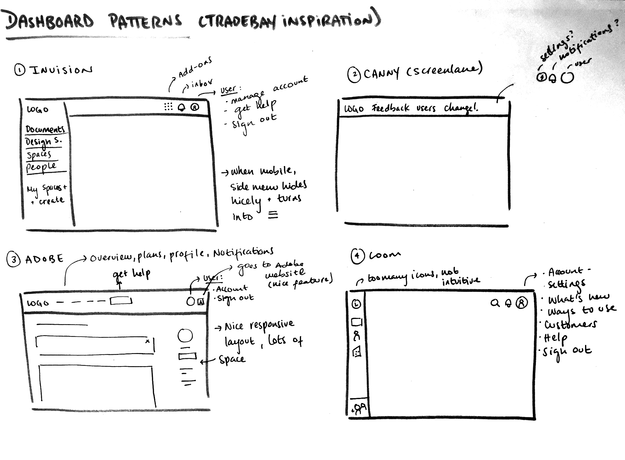
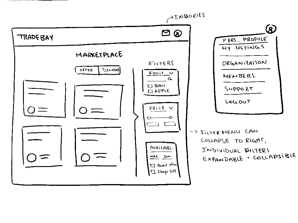
As we decided on the best way to implement the filters I also worked on the navigation of the user app. The original design had a side navigation which was taking up a lot of space and didn't leave many options to implementing the filters how we wanted. Once we decided that the filters worked best as a vertical menu on the right, I re-designed the navigation of the app to open more space and improve the user interface. To do so I created rough wireframes which we discussed as a team before working on the UI design. I began by writing down the flow of how you signed up. I then made some research of other user apps and how they best organized the content for their customers. Finally I visualized a few ideas for how the navigation could be implemented.
Changing the top navigation
The initial idea was to keep the navigation on the right to keep it similar to the original design. However I was able to convince the team that the top navigation would be better in the long run which lead for us to implement the final designs. Below is a mock-up I made with the side navigation. It was an improvement to the previous design but not the most scalable or adaptable given the implementation of the filters.
re-design of the side navigation
original design of the side navigation
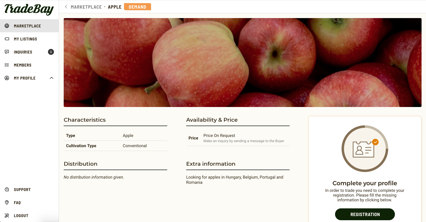
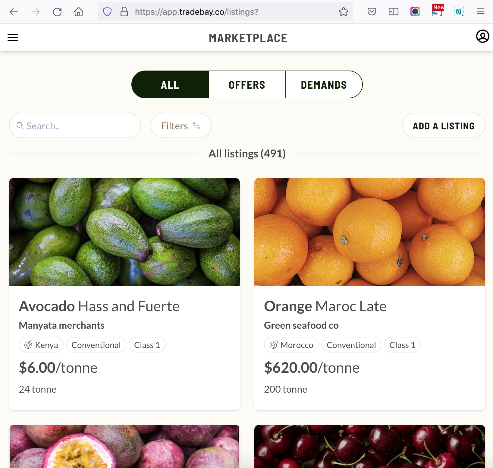
Final marketplace designs and tweaks
After deciding on a final approach I handed the final designs to the developer for him to implement. Using my coding skills I helped with to tweak some of the UI to make it look closer to the design. The final designs for desktop, tablet and mobile can be seen below.
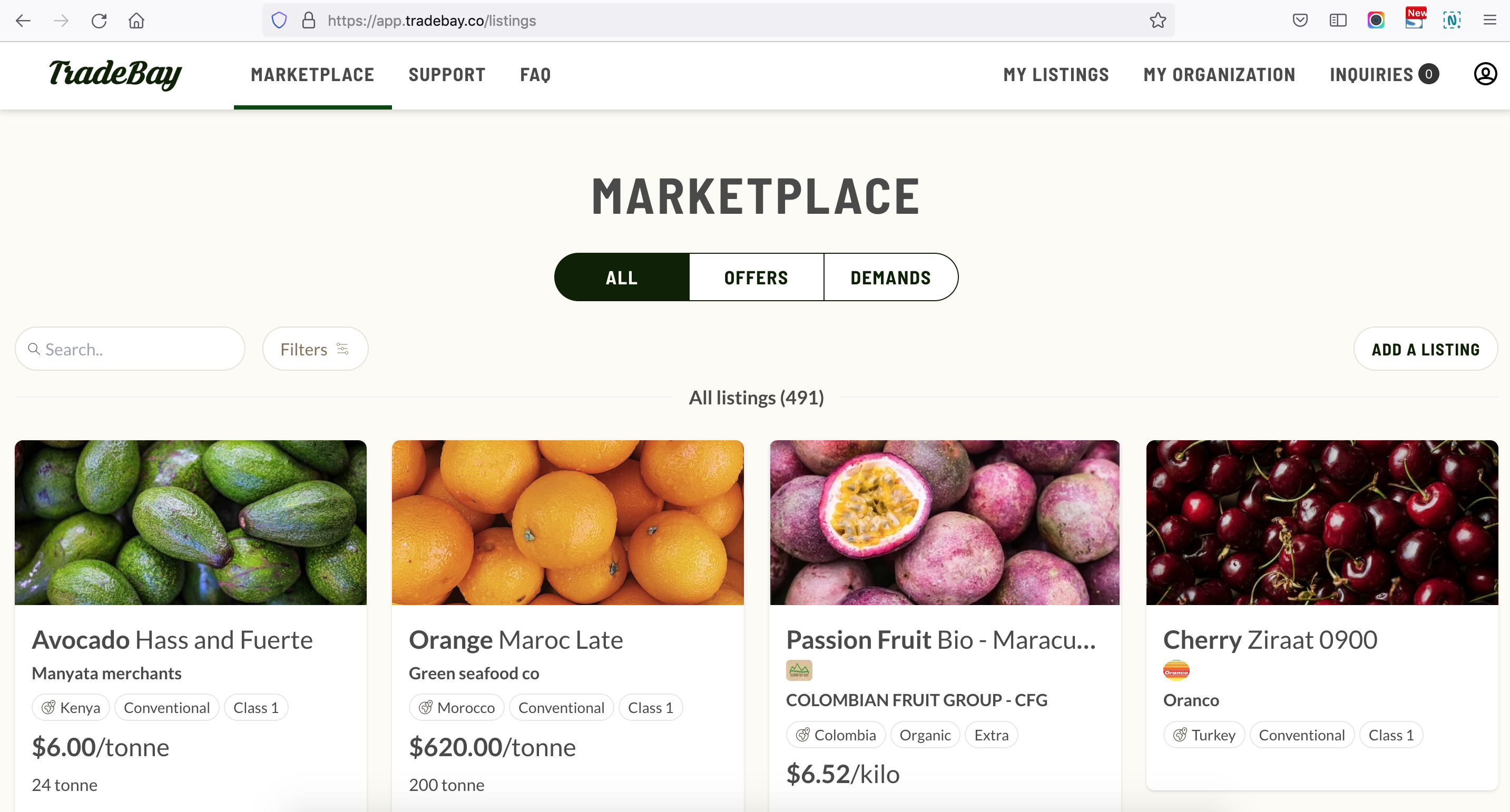
desktop design for marketplace with filters
tablet design for marketplace
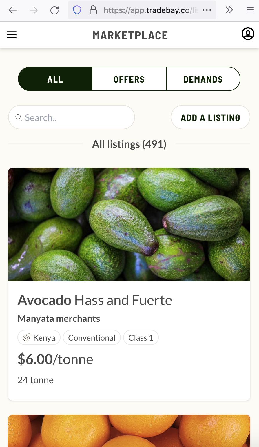
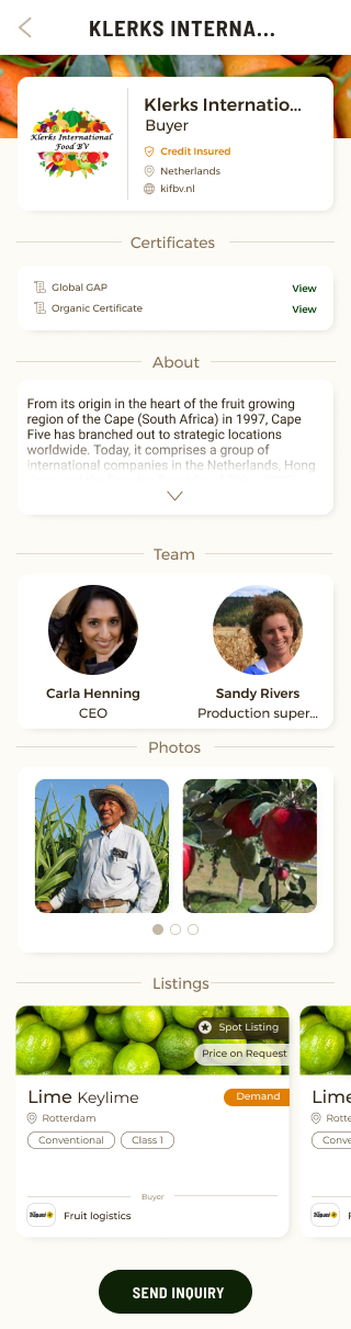
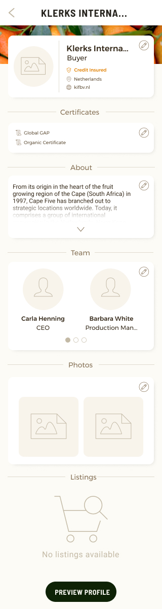
mobile design for marketplace
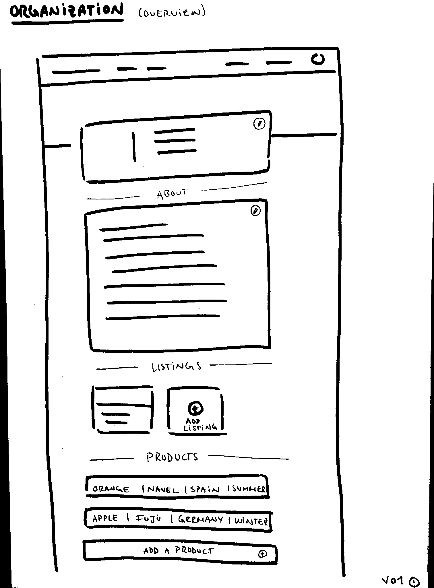
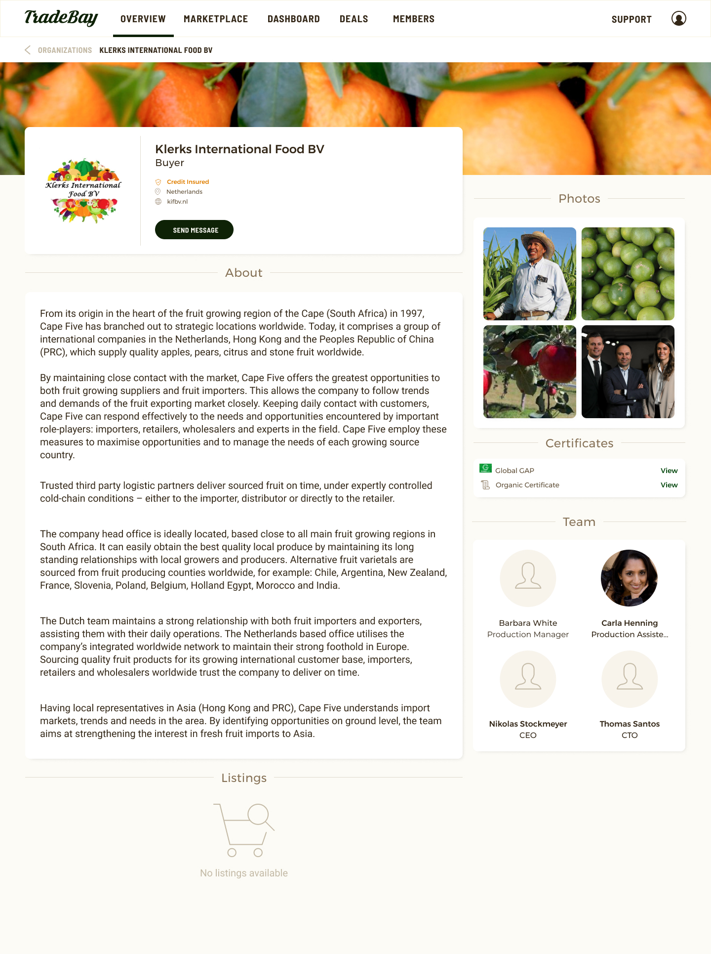
Organization Section Re-design
The next priority on the user app was re-designing the "my organization" section. I started by making a sketch based on the requirements and followed to make the UI designs once it was approved. Below is the first sketch for the page. Since this design was not as complicated as the other pages and the information needed was quite clear, we came to an agreement for the structure quite fast.
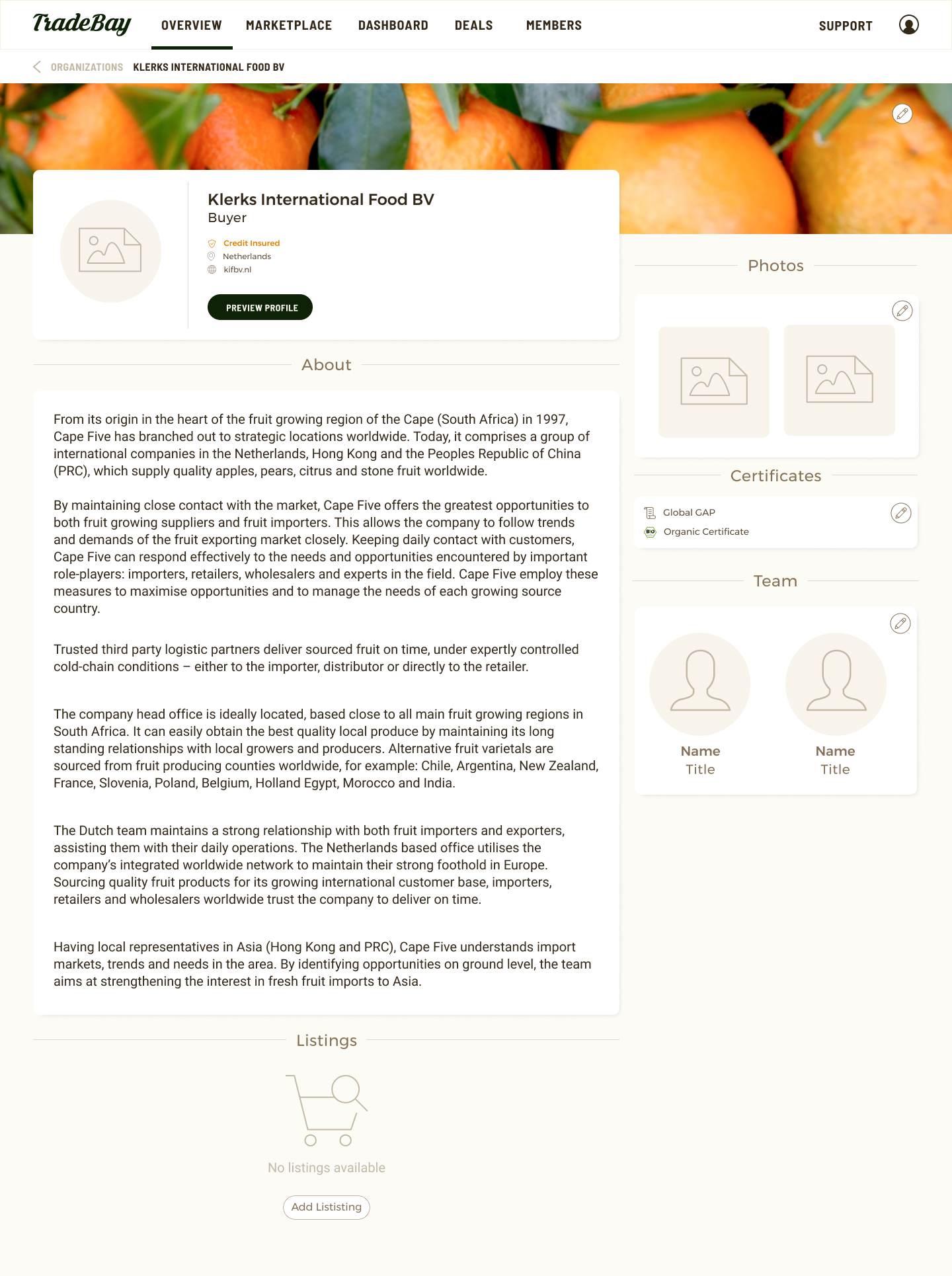
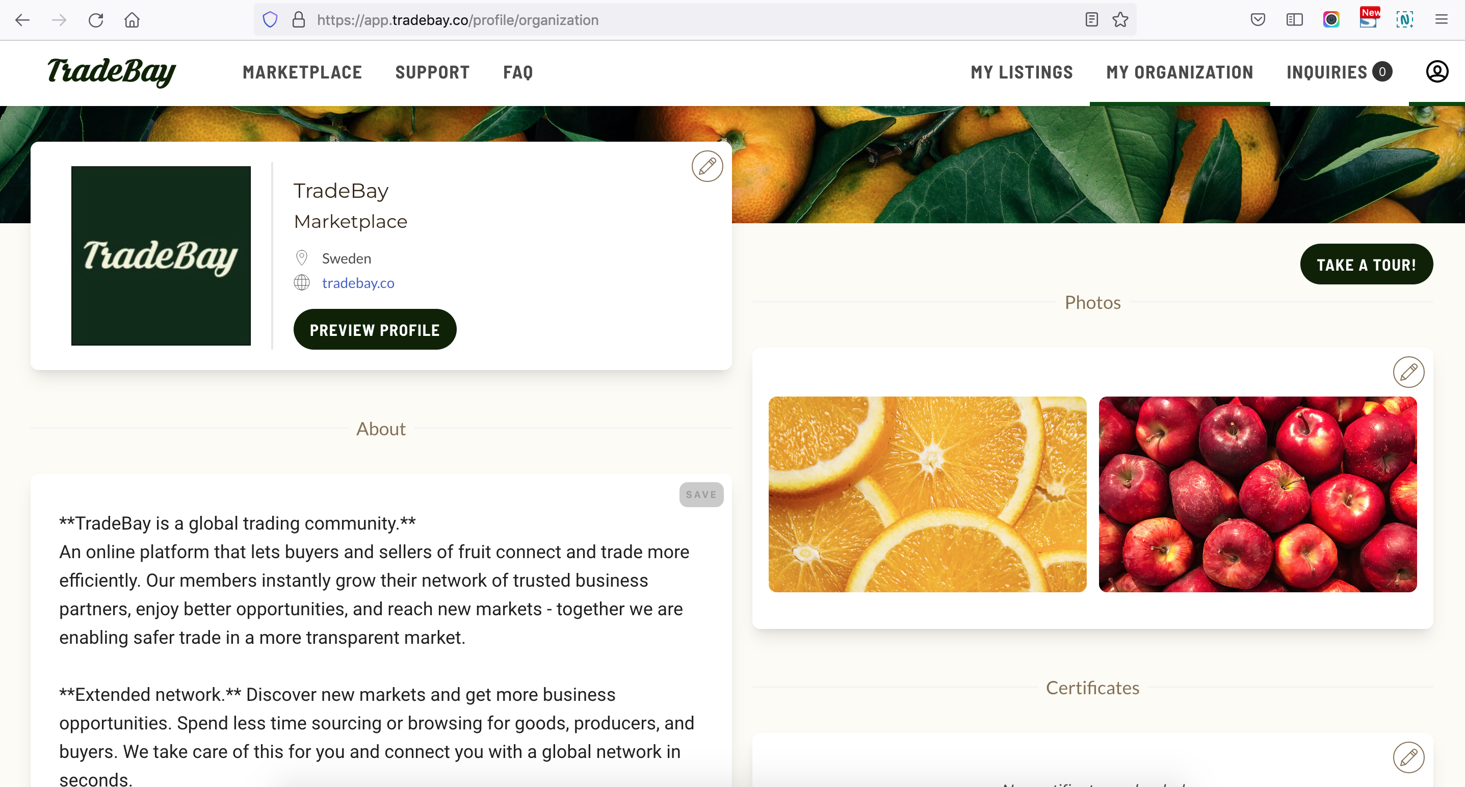
Challenges of the Organization Section Re-Design
For the re-design of the organization page I made a few custom icons based on the icon library from Orion which we were using for the rest of the design. The most challenging part of this designing was creating the edit designs which were not easy for the developer to implement. As can be seen on a screenshot of the live page below there are some discrepancies between the design and the implementation which due to time and technical issues were hard to avoid.
Take-aways and Learnings
Working with Tradebay was a great opportunity for me to grow as a lead designer and tackle many issues at once. I often had to work with the founders to decide which project should be priority and remind them that working on too many things at once is not effective. I had a very good relationship with the team and learned to value meeting often to talk about the design challenges and needs to be able to design the features efficiently. Some of my designs were put to sleep before being implemented and some were not implemented at all due to lack of time and re-setting of priorities. This helped me understand better how to structure time lines and projects to make sure they could be implemented. I was also very happy I had the chance to edit some of the code to better implement the UI detailed in the designs. I not only like to code but also learned to value how meaningful this is in the design process and how relieved the developers were to learn that they did't have to worry about back and forth conversations about fixing design details. I am very thankful for these and many other experiences with Tradebay and look forward to working on more projects like this in the future!