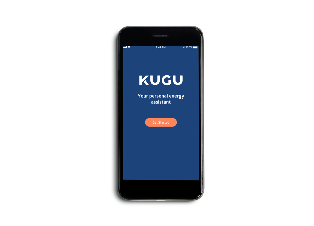
KUGU is a digital product with the aim of increasing energy efficiency in real estate properties in Germany. To do this, they have created a system that is able to track energy consumption and control factors that may influence this such as heating, lighting, and apartment infrastructure (doors and windows). I was approached by KUGU to help them design their very first customer app, which will be the main product residents of a KUGU Smart Home will interact with. Within this iOS and Android app, users are able to access the features that allow for a more conscious and efficient energy consumption. This includes having an overview of their energy usage, seeing what in their apartment is on or off, opened or closed and being able to control how they want specific devices to behave within the architectonic space.
KUGU - Smart Home Customer App
It all started with a Re-branding...
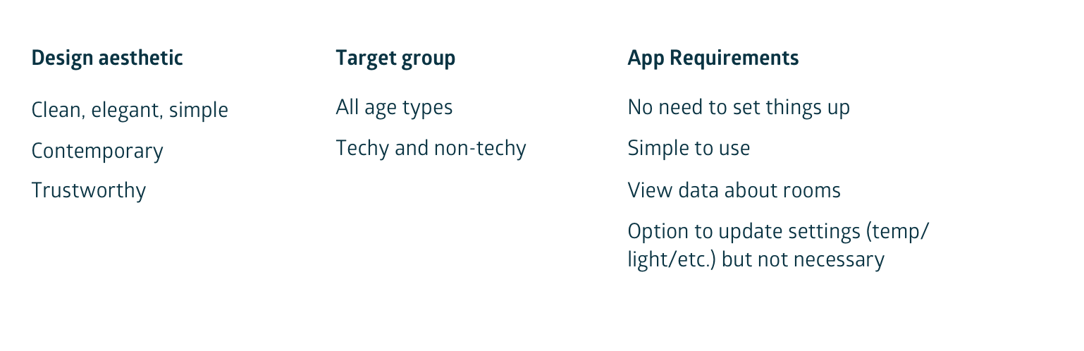
The first task I undertook with KUGU was the re-branding of their existing visual identity. They had a website set-up and an idea of what they wanted their customer app to look like but they were eager to start fresh and give the product a more modern and clean aesthetic. I started by writing their aim using key words to help define the branding style more accurately:
I then gathered inspirational images and colors that matched these ideas and applied them to an initial clean and simple UI style.
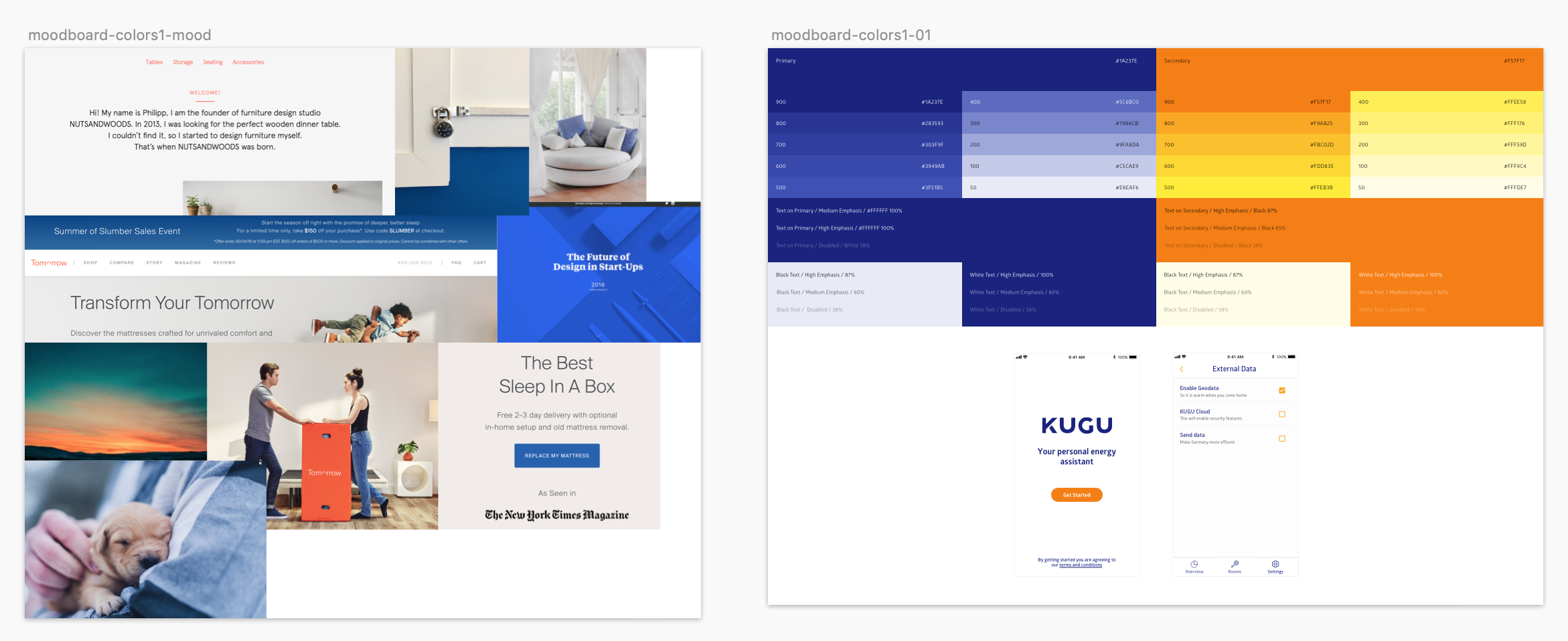
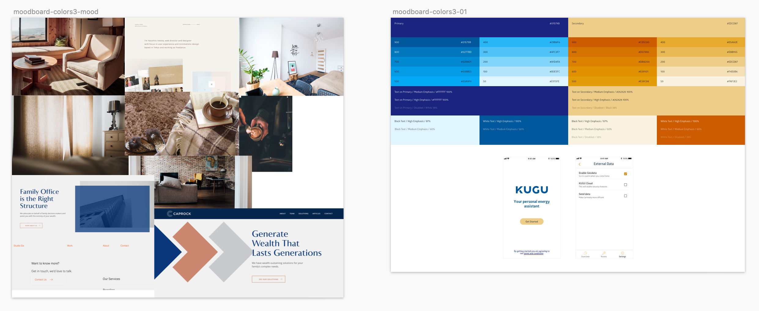
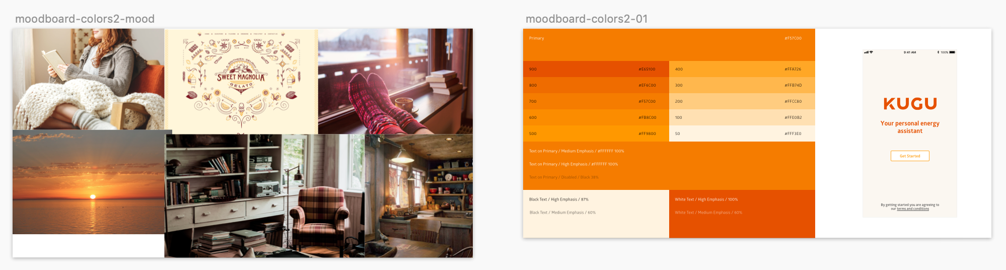
Once we settled on a set of colors and UI style that were appropriate to the brand identity, I began to put together a style guide that would be used to build the rest of the customer app and KUGU digital branding language.
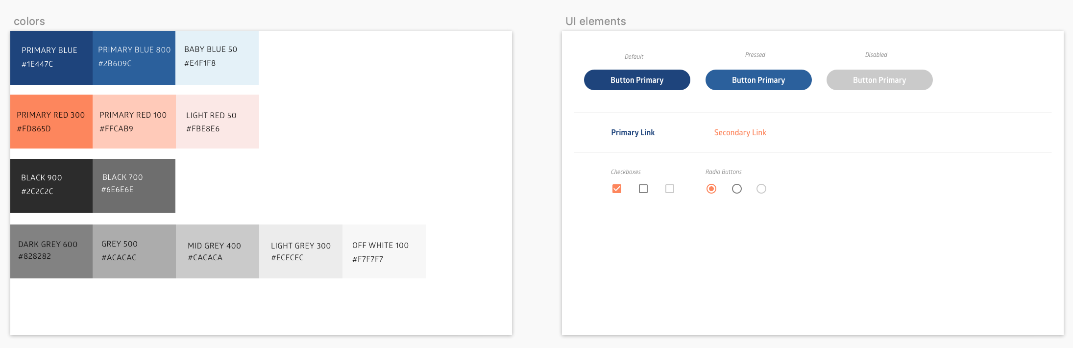
Above is the final color palette and some of the UI elements used for the app branding
How the app is structured
Together with the co-founders, I reduced the main features of the KUGU app into four sections: Onboarding: Here users install the app for the first time by scanning a QR code provided in their keychain. The most important information here is to guide users through the features of the App and to accept specific terms and conditions for data analysis.
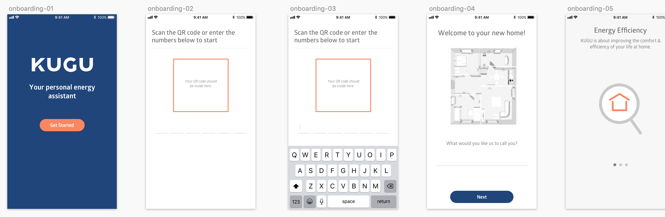
Final screen designs for the onboarding
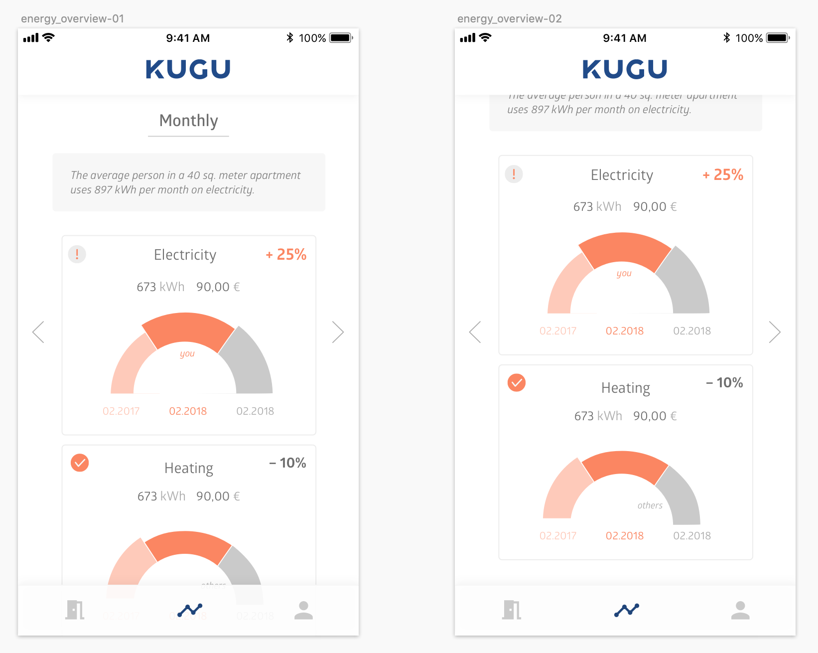
Energy Overview: Users are able to see an overview of their general energy consumption (electricity) and their heating consumption. The idea here is that the user can choose a preferred view (daily, monthly, yearly) and can get a general picture of how he or she has improved of fallen behind the consumption of the previous year.
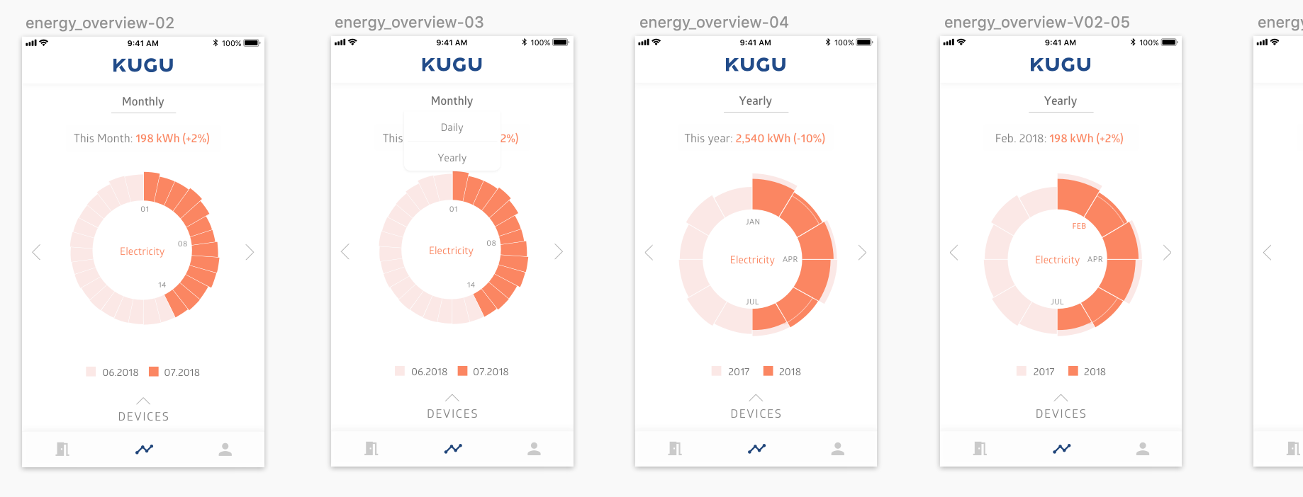
Final screen designs for the energy section
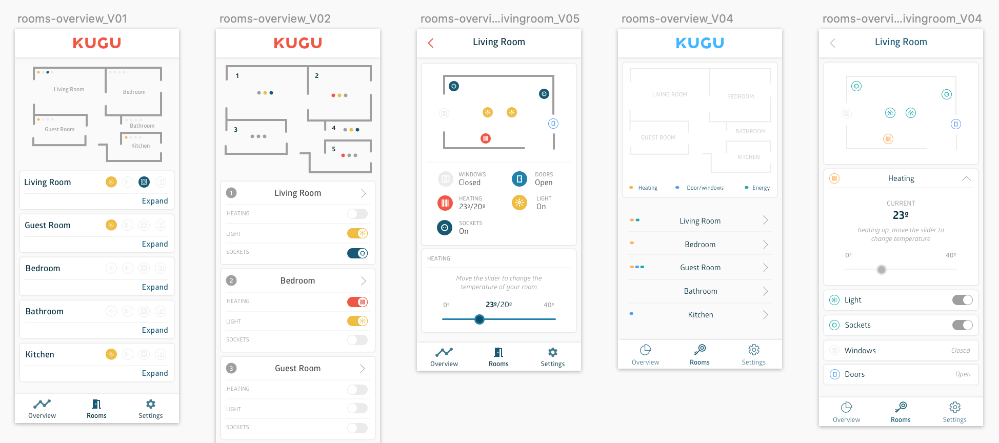
Rooms Overview: This section gives the user the opportunity to see the floor plan of the building and get a quick idea of what devices are on or off and if any doors or windows are open.
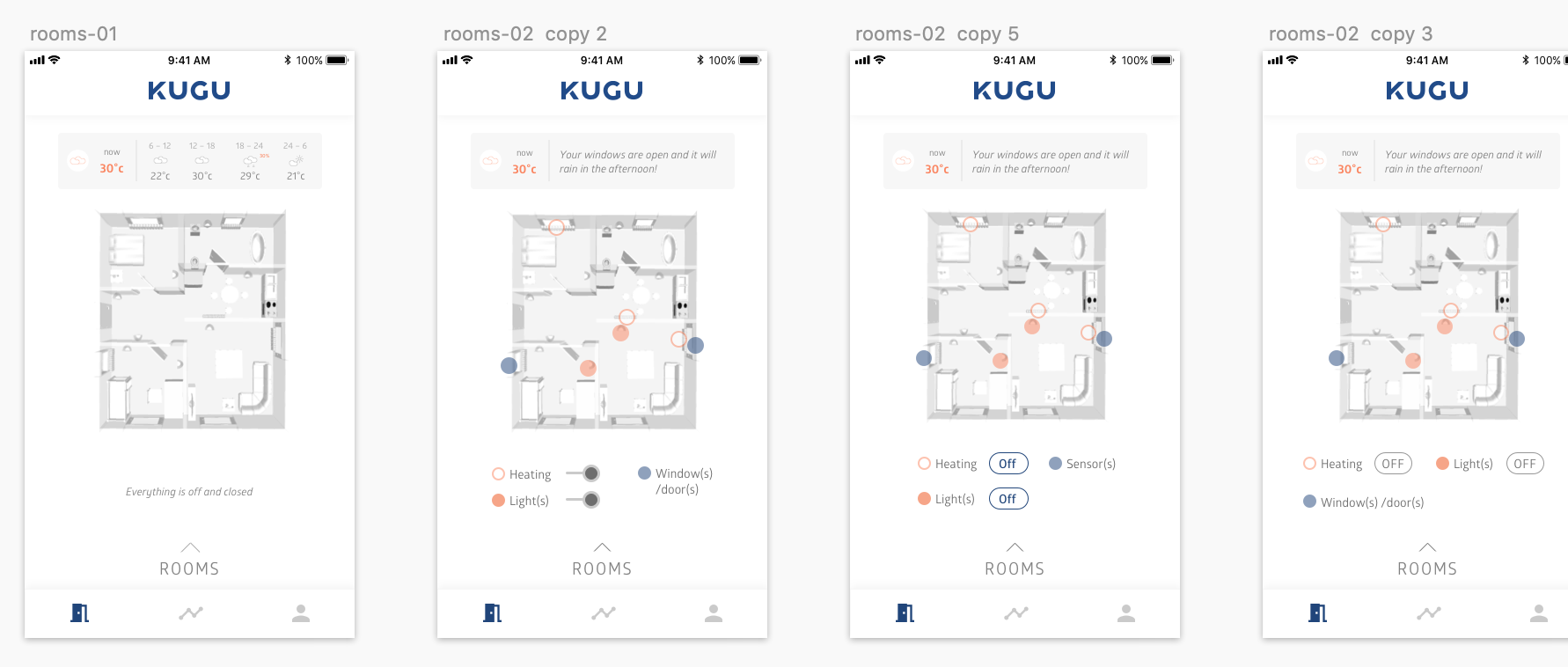
Final screen designs for the rooms overview section
Settings: In this section, users can access the standard settings within an app in addition to some KUGU specific settings about data privacy.
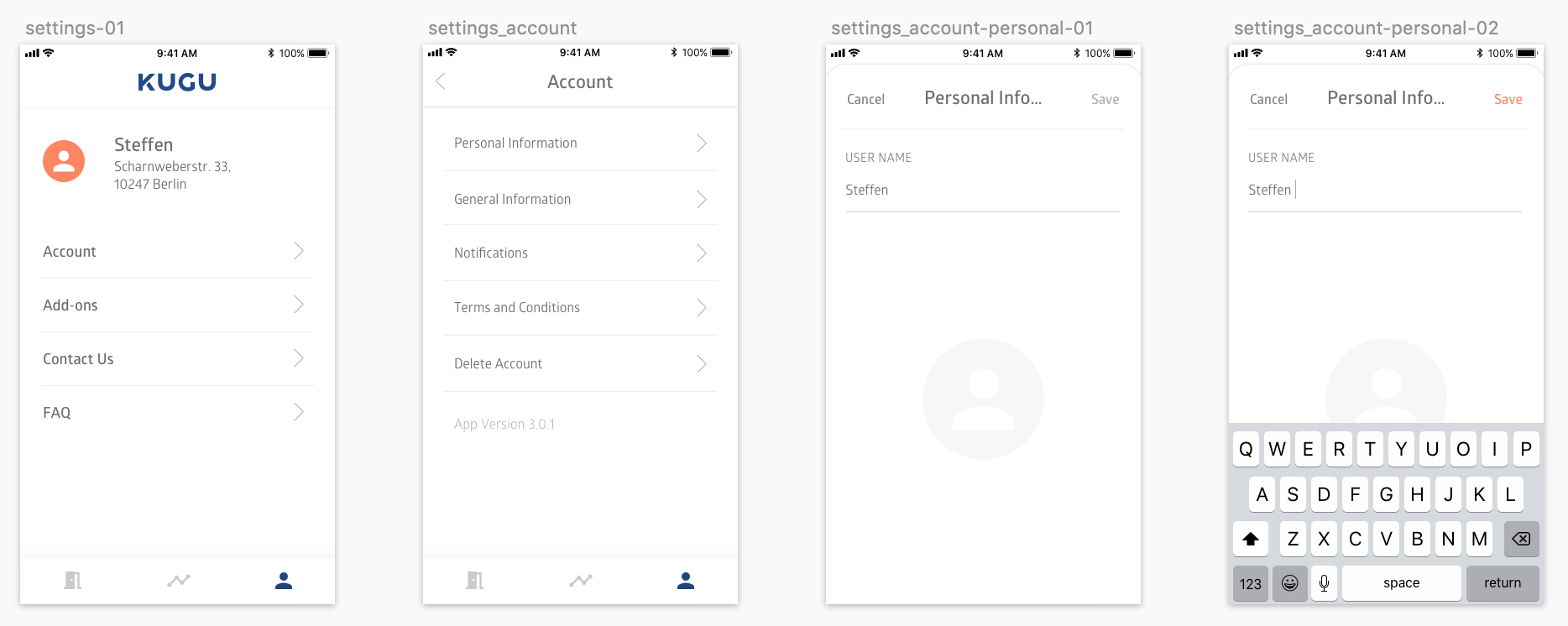
Final screen designs for the settings section
It sounded simple to start with. However to reach these final designs, the process was not easy. The most challenging sections, energy and rooms, went through various iterations and user tests.
The data challenge
A big challenge during this project was figuring out how to display the data in a way that would be clear to the customers and at the same time was in line with the purpose of KUGU. KUGU's aim is to encourage users to use their energy efficiently by providing the user where we decided to display this. One of the initial ideas was to have an energy overview so that users could see their usage overtime and try to improve in the future.
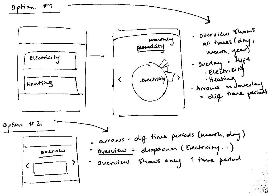
Sketches of how to display the energy overview
Here it was tricky to decide how to arrange the navigation and what would be the most intuitive way for the user to go from one screen to the other.
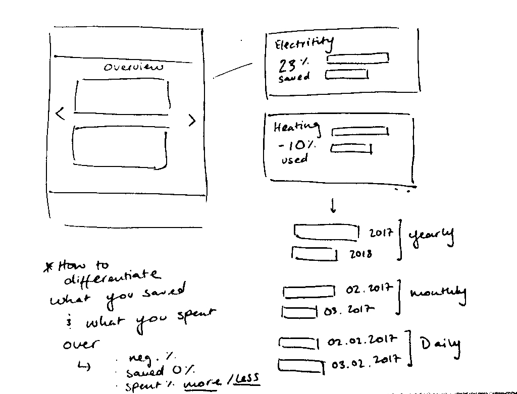
After a lot of reiterations and talking to users, we decided to go for a more simple approach in which users can see either their heating or electricity usage separately without having one screen to compare the two. We decided to keep the design, however, for future app versions and/or ideas.
Designs for the energy overview
Architecture Experience: Floor planning
One of the most interesting parts of working on this project was being able to expand my skills in the visual field and play with new programs in order to achieve the requirements for the app. One of these was working with the program Sweet Home 3D in order to create the floor plan aesthetic that will later be automatically generated for each KUGU smart building. It was challenging to choose the right perspective and match it the UI of the app to create a coherent visual style.
Although the first designs did not include the 3D floor plan it was also difficult, through out the entire design process, to figure out the best visual solution to highlight the necessary information and include all controls in one screen.
Initial floor plan designs with the old styling and color palette
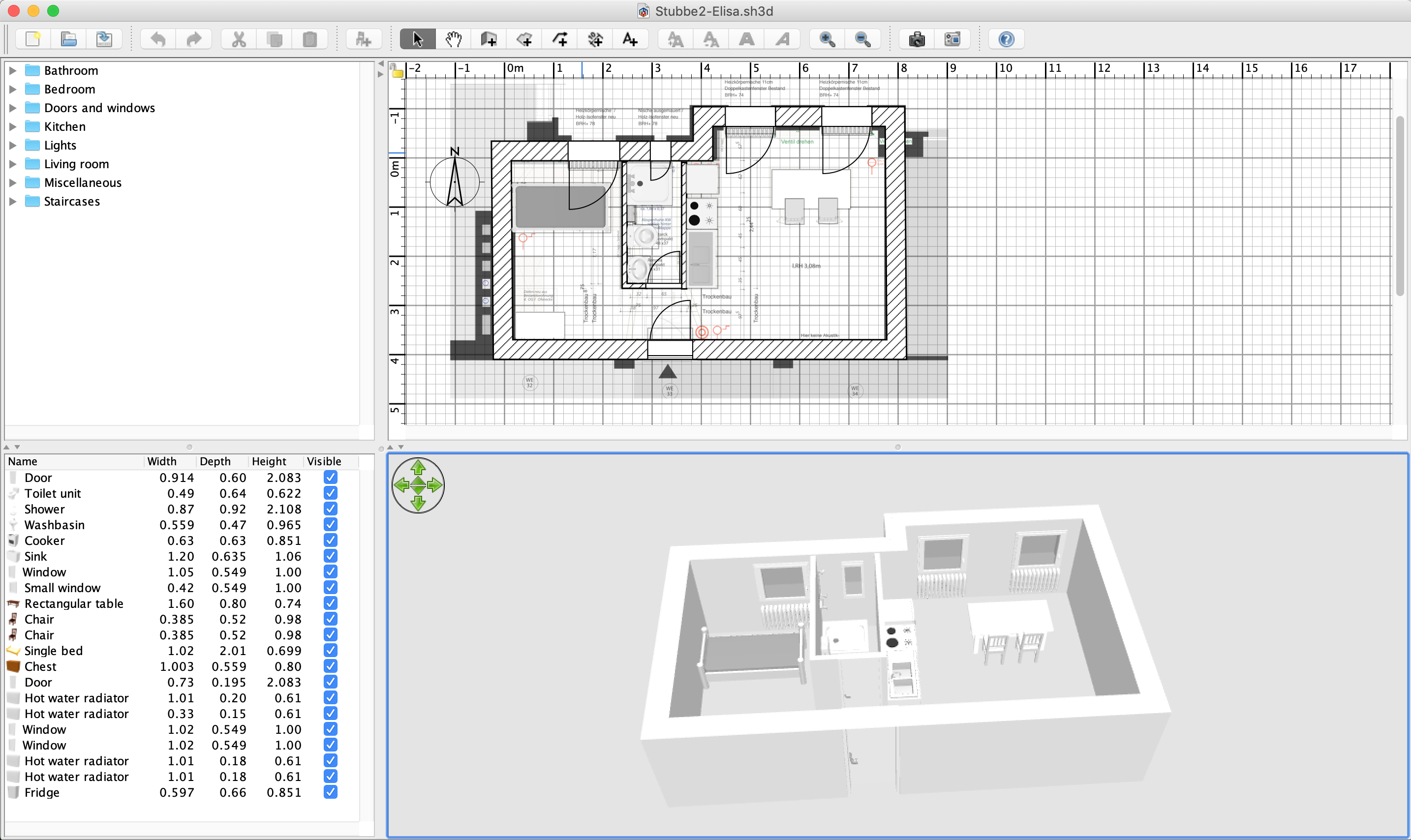
Sample rendering in Sweet Home 3D
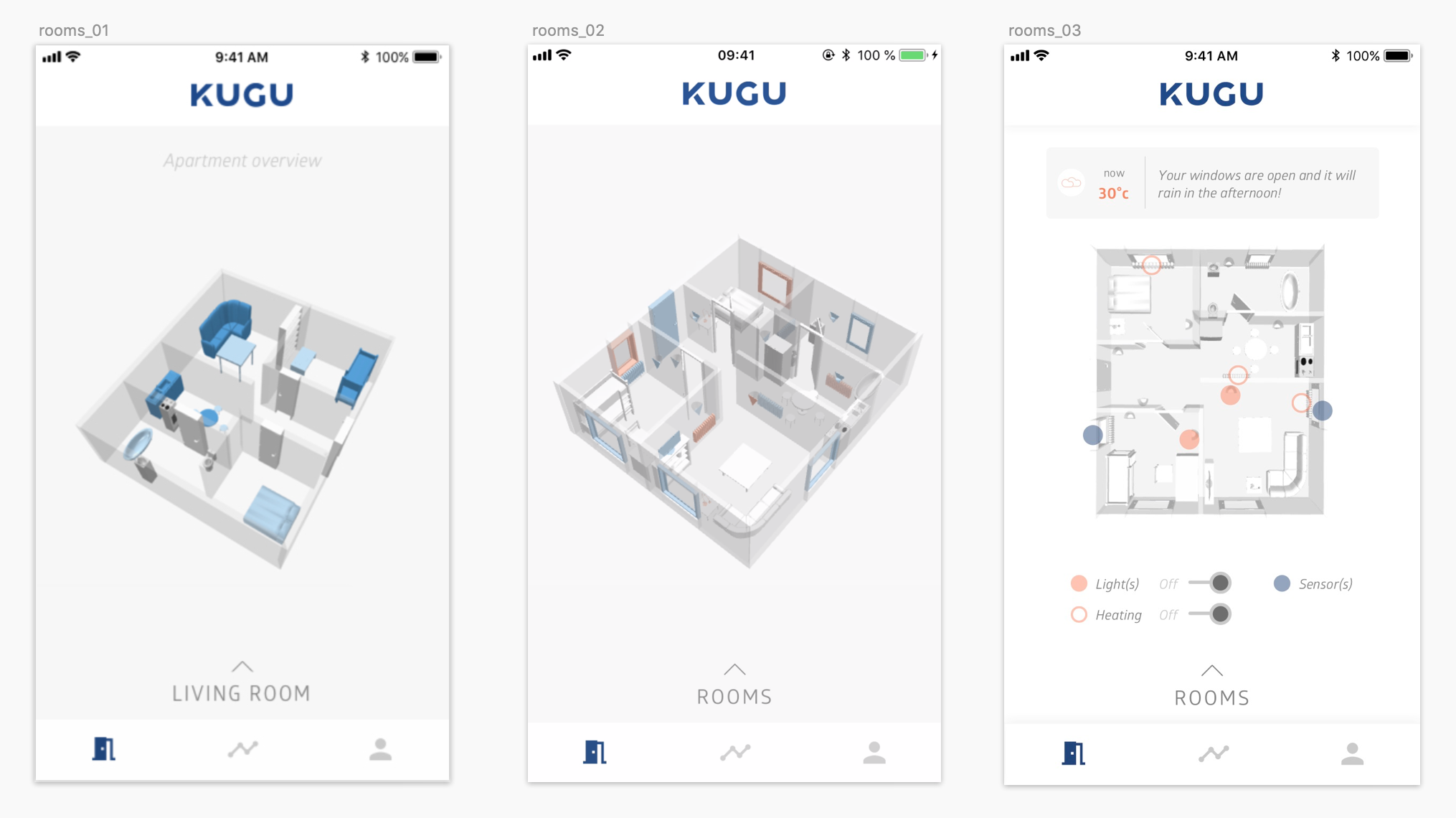
3D versions before reaching the final design (right)
Learnings and Outcomes
Probably one of the most revealing parts of the process was user testing. We did our first testing session focusing on the energy and rooms screens to get impressions on the clarity and relevance of the data presented. I made a prototype of the app in Invision and using Quick Time, we recorded the sessions as well as filled out forms with notes on the key patterns and user information. The entire process made us aware of the importance of showing the designs to the users to verify if the way we were presenting the data was clear or could be improved.
At the end of the process, we decided to test an initial design and later evaluate how easily users are able to adapt to the information display and extract value from it. I hope that once users are installed in the building and have used the app for a few weeks, we can re-evaluate the design and make significant improvements to make the product as clear and user friendly as can be.